


Why Are C Curves More Common Than S Curves in MMM?
Hint: There could be survivorship bias at play


In Marketing Mix Modeling (MMM), saturation curves generally fall into two categories:
S-Curves
C-Curves
In my experience of over a decade I have seen more C curves than S curves. The experts that I have spoken to in the past and experts like Everard Hunder, Prof. dr. Koen Pauwels, Bruce Clark, John James seem to agree with this pattern.
In this post, I’ll share insights into how these curves impact marketing effectiveness.
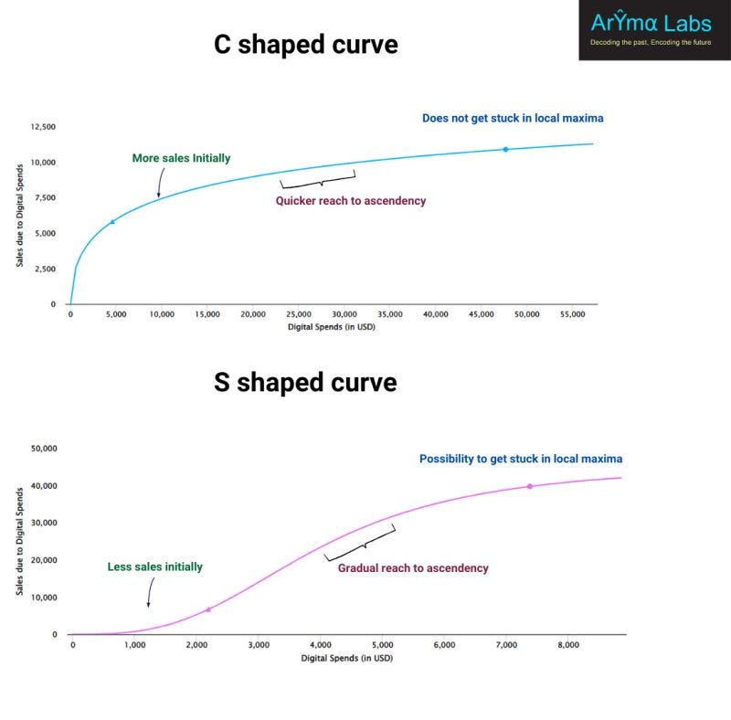
Sales Impact:
C-Curves: Higher initial sales.
S-Curves: Lower initial sales. Sometimes, even close to zero-despite significant spending.
Ascendancy & Saturation:
C-Curves: Reach saturation quickly, meaning you can identify diminishing returns faster.
S-Curves: Take longer to ascend, requiring substantial spending before yielding strong returns.
The Local Maxima Problem
C-Curves: No risk of getting stuck in local maxima.
S-Curves: More prone to local maxima, which can mislead budget optimizers into suboptimal results.
If you are optimizing marketing budgets, misunderstanding these curves can mean leaving money on the table. Knowing whether you are dealing with an S or C curve can help you make accurate budget allocation decisions.
But why do we see C curves more often than S Curves
My Initial Thoughts Were:
1. Faster, Frictionless Mediums – Content dissemination is quicker than ever, giving customers more information to make decisions faster. This reduces the gradual adoption pattern that S curves often represent.
2.High-Quality Creatives/Campaigns – No agency deliberately designs ineffective creatives. Most campaigns are built to persuade/ nudge people to buy, leading to strong initial responses rather than the slow-build effect seen in S curves.
A Deeper Dive: Survivorship Bias ?
Building upon the above two points, Venkat Raman and I decided to brainstorm more on this.
We hashed out a lot of possibilities and an interesting connection between S and c curves and survivorship bias came about - a concept that was famously addressed by WWII statistician Abraham Wald.
Wald studied returning aircraft riddled with bullet holes and realized something counterintuitive: the damage on these planes wasn’t the full picture. The planes that had been hit in critical areas- like the engines or cockpit-never made it back.
Instead of reinforcing the areas with visible damage, Wald correctly recommended strengthening the parts that had little/no damage on the surviving planes, as that’s where fatal hits were likely occurring !!
The Parallel to C & S Curves
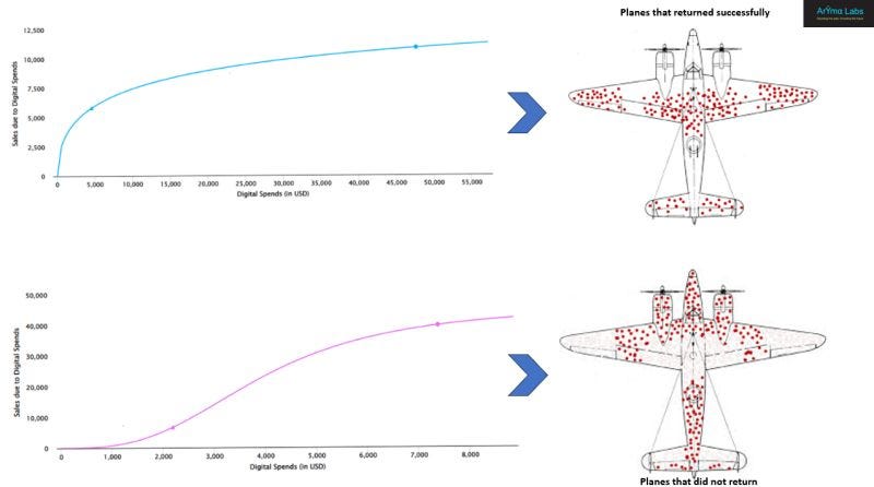
S curves may be rare because ineffective creatives and mediums get cut early- just like WW2 planes that never returned. Marketers naturally pull the plug on underperforming campaigns, meaning we mostly observe the "survivors"- which tend to follow the C curve pattern.
A Positive Sign for Marketing
The fact that we are seeing more C curves is actually a great sign - it reflects improved marketing effectiveness and the growing adoption of marketing measurement solutions.
The feedback loop is getting faster, thanks to techniques like MMM, allowing marketers to optimize campaigns more efficiently than ever before.
Just as missing data led to flawed assumptions in WWII until Wald’s insight corrected them, our observations in MMM might be skewed by the campaigns that "make it back to base." But in this case, that’s a sign of progress.
Thanks for reading.
For accurate MMM implementation, reach out to us
 | A guest post by
|